Key Benefits of Responsive Web Design for NYC Businesses

In a place like New York City, your website isn't just a URL—it's your digital storefront. But what happens when that storefront is locked for half of your potential customers? That's exactly what you're doing without a responsive website. It's no longer just a nice-to-have; it's a fundamental part of doing business here.
Why Responsive Design Is a Must-Have for NYC Businesses
Think of it this way: if you owned a coffee shop in Queens, you wouldn't design it just for people sitting down while completely ignoring the morning rush grabbing coffee on their way to the subway. You’d lose a massive chunk of your business. A website that isn't responsive does the same thing—it shuts out the huge number of people browsing on their smartphones, whether they're looking up your hours on the LIRR or searching for your services while walking through Astoria.
Responsive design fixes this problem. It’s an approach where your website intelligently adapts its layout, images, and menus to fit any screen size perfectly. This means someone researching your services on a desktop in a Midtown office gets the same great experience as someone finding you on their phone in a Brooklyn park. It just works, everywhere.
This infographic really drives home the business impact of getting this right.
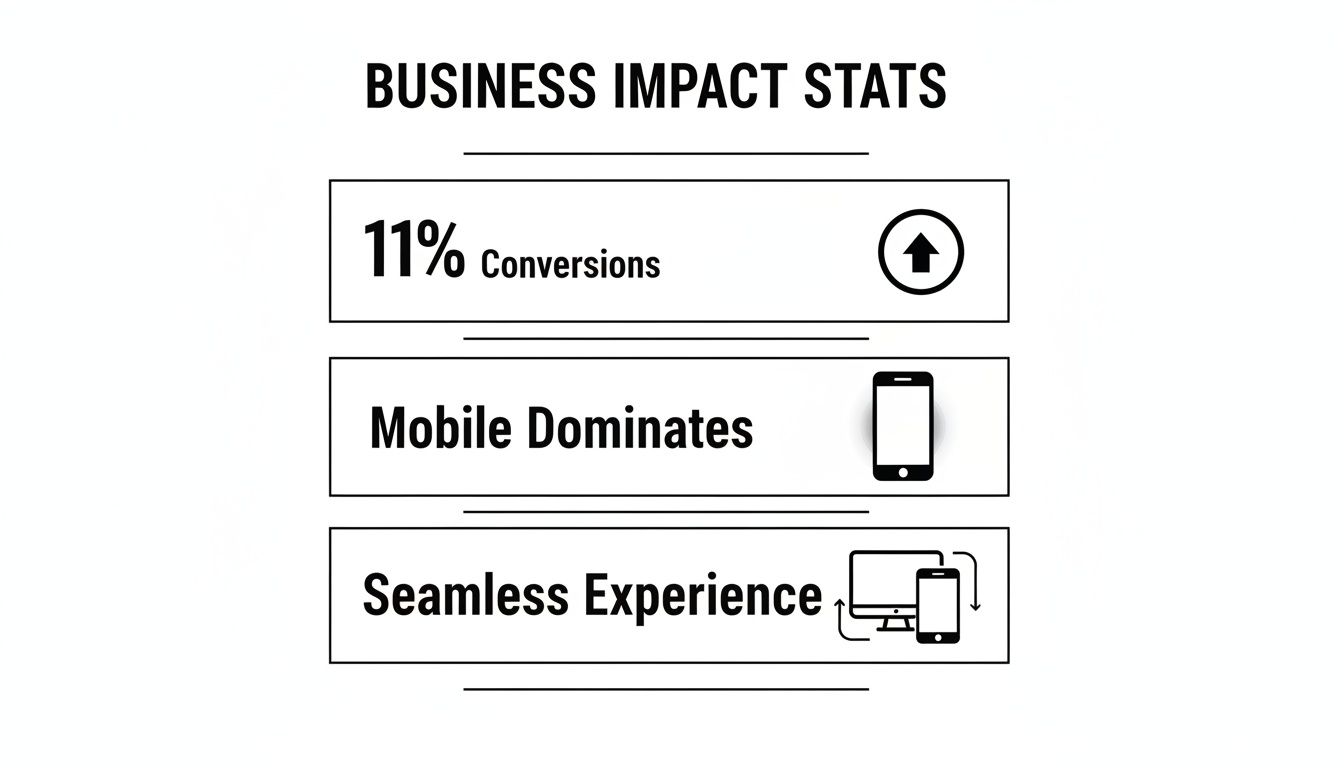
The numbers don't lie. A better, more flexible user experience leads directly to more sales and acknowledges the reality that most people are on their phones.
The Real-World Impact on Your Bottom Line
For a local NYC business, the benefits here are direct and easy to measure. We're not just talking about aesthetics; we're talking about real money. Data shows that responsive websites see an 11% higher conversion rate on average compared to their clunky, non-responsive counterparts. For a plumber in the Bronx or a boutique in SoHo, an 11% lift in leads or sales is a game-changer.
A responsive website isn't just one website. It’s a single, powerful tool that works perfectly for every customer, on every device, every single time. It simplifies your marketing, strengthens your SEO, and boosts your revenue.
The whole point is to eliminate that awful user experience of pinching and zooming on a tiny screen. You want to make it easy for people to give you their business.
To get a clearer picture of how these benefits translate into tangible results, let's break down the key impacts.
Responsive Design at a Glance: Key Impacts on Your Business
This table provides a quick summary of the primary benefits of responsive design, showing the direct impact on key business metrics.
| Business Goal | Impact of Responsive Design | Key Statistic |
|---|---|---|
| Increase Leads & Sales | Better user experience reduces friction and encourages action. | 11% higher conversion rates on average. |
| Improve SEO & Visibility | Google prioritizes mobile-friendly sites in search results. | Over 60% of all searches happen on mobile devices. |
| Reduce Costs & Time | Manage one website, not separate desktop and mobile versions. | Lowers long-term maintenance and development costs. |
| Enhance Brand Trust | A professional, seamless experience builds credibility. | 74% of users are more likely to return to a mobile-friendly site. |
Ultimately, a responsive approach ensures you're meeting your customers where they are, providing a consistent and positive impression of your brand no matter how they find you.
For a deeper dive, this resource on The Benefits Of Responsive Web Design For Web Development Businesses offers even more perspective. In the sections ahead, we’ll explore exactly how this modern approach helps you rank higher in local search, delight your users, and even save you money.
How a Mobile-First Approach Helps You Win at Local SEO
In a place like New York City, if customers can't find you online, you might as well be invisible. The single biggest reason to embrace responsive web design is how it directly impacts your visibility on Google. It used to be that Google judged your site based on its desktop version. Not anymore.
Things have completely flipped. Google now uses what’s called mobile-first indexing.
Think of it this way: Google is a restaurant critic who now only judges your entire establishment based on how well your takeout and delivery service works. Your fancy dining room doesn't matter if the to-go experience is a disaster. Google’s crawlers now primarily look at the mobile version of your website to decide how good it is. If your site is a clunky, broken mess on a phone, your search rankings will tank across the board—even for people searching on a desktop.

Picture a tourist standing in the middle of Times Square, pulling out their phone to search for "best slice near me." If your Queens-style pizza shop has a site that won't load or requires endless pinching and zooming, they'll never see you. Google will serve up your competitor down the street who offers a seamless mobile experience instead.
Why Google's Algorithm Loves Responsive Sites
A responsive website naturally improves the very signals Google looks for to determine a quality result. When someone lands on your site from their phone and can actually use it, they tend to stick around. That positive user behavior sends a powerful message to Google: this site is helpful.
Specifically, a responsive design boosts crucial SEO metrics:
- Lower Bounce Rates: Visitors are far less likely to hit the "back" button in frustration when your site just works on their device.
- Longer Time on Site: A user-friendly mobile site encourages people to browse, read more pages, and dig deeper, which signals strong engagement.
- One Powerful URL: You avoid splitting your SEO power between a desktop site and a separate “m.yourbusiness.com” version. All your hard-earned backlinks and authority are consolidated into one place.
Since Google officially switched to mobile-first indexing in 2019, having a responsive site isn’t just a good idea—it’s table stakes. This is especially true for NYC businesses trying to capture the 78% of local mobile searches that lead to an in-person purchase.
The proof is in the numbers. Globally, over 62% of businesses saw a jump in sales after launching a responsive mobile site.
This single-site approach simplifies everything. You focus your SEO efforts on one URL, giving you a massive advantage in the hyper-competitive local searches across Queens, Brooklyn, and Manhattan. Grasping the importance of mobile optimization for your website is the critical first step. A responsive design doesn't just let you play the local search game; it sets you up to win it.
Create a User Experience That Skyrockets Conversions
While smart SEO gets people to your digital doorstep, a fantastic user experience (UX) is what welcomes them inside and makes them want to stay. The impact of responsive web design goes way beyond just search rankings; it directly shapes how a potential customer feels about your business. Good feelings build trust, and trust is what drives conversions.
Think about it like this: imagine walking into a cluttered, disorganized shop in Queens. The aisles are too narrow, things are hard to find, and you can't figure out where to pay. You'd probably turn around and leave. That’s exactly what a non-responsive website does to mobile visitors—it forces them to constantly pinch, zoom, and scroll sideways just to make sense of your page. It's frustrating.
A responsive site, on the other hand, is like a modern, well-lit boutique. Everything is easy to find, the text is a comfortable size, and the buttons are simple to tap. It makes the entire process feel effortless, which is the whole point of great UX.
Turning a Smooth Experience into Sales
When your website is a pleasure to use on any device, you’re basically removing all the roadblocks that stand between a visitor and a sale. They can find what they need, fill out a contact form, or buy a product without getting annoyed and giving up. This is where responsive design starts making a real difference to your bottom line.
So, how does a responsive site pull this off? It’s built on a few core ideas:
- Fluid Grids: The layout isn't rigid or fixed. Instead, it uses percentages, allowing the entire structure to flow and resize perfectly to fit the screen it's on.
- Flexible Images: Pictures automatically scale up or down to fit their containers. This means they never look broken, and they don't slow the page down.
- Intuitive Navigation: On smaller screens, complex menus neatly tuck into mobile-friendly "hamburger" icons, and buttons are made large enough to be tapped easily with a thumb.
These technical details work together to build credibility and make it dead simple for a customer to take that next step. You can check out some powerful responsive web design examples to see these principles in action.
The NYC Conversion Connection
For any local business in NYC—whether you're an e-commerce brand in Brooklyn or a contractor in Manhattan—this seamless experience is a massive revenue driver. One study found that mobile-optimized sites can see 40% higher conversion rates compared to those that aren't.
Some businesses have even seen conversions leap by an incredible 400% after improving their user experience. When you consider that half of all e-commerce sales in the U.S. now happen on smartphones, not having a perfect mobile checkout is like locking your doors to half your potential customers. A positive user journey isn't just a "nice-to-have" feature anymore; it's a vital sales tool for thriving in a competitive market like New York City.
Streamline Your Website Management and Reduce Costs

Beyond the fancy marketing stats, one of the most practical, down-to-earth benefits of responsive design is its raw efficiency. For any business owner in Queens trying to make every dollar count, this is huge. It means saving real time and real money.
Think back to the old way of doing things. To cater to phone users, businesses had to build a completely separate mobile website—you’ve probably seen them at URLs like m.yourbusiness.com. It seemed like a good idea at the time, but it quickly turned into an operational headache. You essentially had two different businesses to run online.
Imagine running a local Jackson Heights cafe and having to update your daily specials on two different menus every single morning. That’s what managing two websites feels like. Every new blog post, every promotion, every price change had to be done twice. It wasn't just tedious; it was a breeding ground for mistakes and inconsistencies.
The Power of a Single Website
Responsive design throws that entire mess out the window. It’s a “one and done” approach. You have one website, one set of content, and one backend to manage it all. That's it.
When you need to update your hours or add a new testimonial, you do it once. The website takes care of the rest, making sure it looks perfect on every device. This simplified workflow pays off in a few major ways:
- Reduced Maintenance Time: You literally cut your website update time in half. That’s time you can now spend on marketing, talking to customers, or just about anything else that actually grows your business.
- Lower Development Costs: Building and maintaining one smart, flexible website is far more affordable in the long run than paying to support two separate ones.
- Minimized Risk of Errors: With a single source of truth for your content, you eliminate the risk of showing different prices or conflicting information to your mobile and desktop visitors.
A single responsive website doesn't just reduce your workload; it centralizes your digital presence, making your marketing efforts more cohesive and your brand message more consistent across every customer touchpoint.
At the end of the day, this efficiency is about more than just saving a few bucks. It’s about reallocating your most valuable asset—your time—away from grunt work and toward strategy. Instead of getting bogged down in repetitive website tweaks, you can focus on initiatives that actually bring in new business and help you stand out in the crowded NYC market.
Future-Proof Your Brand for Tomorrow's Devices
The tech world moves at a dizzying pace. Every year brings a new wave of smartphones, tablets, foldable screens, and even smartwatches—each with its own unique screen size and resolution. Staying ahead of this curve can feel like a constant, expensive battle. Without the right web strategy, your site risks looking outdated or just plain broken on the next hot gadget.
This is where the real long-term value of responsive web design shines. It's not just a fix for the devices we have now; it's a flexible foundation for the ones we can't even imagine yet.
A responsive site isn’t built on a rigid, pixel-perfect layout that only works for one screen. Instead, it uses a fluid, percentage-based grid. Think of it like building with LEGOs instead of a fixed mold. The pieces are designed to connect and reconfigure, allowing the structure to adapt to any shape without falling apart. This built-in flexibility means your website is already equipped for whatever comes next.
Investing in Adaptability
Adopting this forward-thinking approach saves you from the painful cycle of overhauling your entire website every few years. Your site just… adapts.
This idea of "future-proofing" ensures your brand always looks professional and put-together, no matter how a customer is viewing your site. It’s about protecting your initial investment and giving you some much-needed peace of mind.
A responsive design isn't a one-and-done project. It’s a long-term strategy that keeps your digital presence relevant, functional, and accessible as technology marches on.
Instead of scrambling to react every time a new device hits the market, a responsive website is proactively prepared for it. This positions your business as a stable, modern brand that’s ready for customers on any platform—not just today, but for years to come. It’s simply the smartest way to make sure your digital storefront never looks obsolete.
How to Get Started with a Responsive Website
It's one thing to understand why you need a responsive website, but it's another to actually make it happen. If you're running a business here in Queens or anywhere across NYC, you might be looking at your current site and wondering, "Okay, what now?" The good news is, you don't need to be a coding wizard to get the ball rolling.
The first step is a simple, honest check-up. Pull up your website on your phone right now. Go ahead, I'll wait. Can you actually read the text without pinching and zooming? Are the buttons big enough for a thumb to tap easily? Is the menu a nightmare to navigate? This little self-audit is your starting point.
Your Action Plan for a Better Website
Once you've felt the frustration your customers might be feeling, it’s time to map out a solution. Moving to a responsive design follows a pretty straightforward path, whether you're starting fresh or giving an old site a much-needed facelift.
Here's what that process typically looks like when you work with a professional team:
- Discovery and Strategy: This is where we sit down and talk about your business. Who are your customers in NYC? What do you need them to do on your site? This isn't just about pretty pictures; it's about building a tool that helps you make money.
- Design and Development: Now for the fun part. We'll sketch out a user-friendly design that actually looks and feels like your brand, then build it on a solid, flexible foundation. This is where we ensure it works perfectly whether it's on a giant monitor in an office or a phone on the 7 train.
- Launch and Optimization: After we've tested everything until we're blue in the face, we launch your new site. But we don't just disappear. We keep an eye on its performance to make sure it's actually bringing in leads and helping your business grow.
Partnering with a web design expert isn't just about getting a new website. It's about investing in a strategic tool designed to attract local customers, build trust, and generate a measurable return on your investment.
If you want to see what's out there, checking out some great responsive web design examples can give you a real sense of the possibilities.
Let's Build Your Responsive Future
If your website isn't giving customers the experience they expect, we can fix that. As a local Queens-based agency, we live and breathe this stuff. We build websites for NYC businesses that are fast, secure, and designed from the ground up to turn visitors into customers.
Getting it right from the start means following proven principles. To get a handle on what goes into a truly effective site, take a look at our guide on responsive web design best practices.
When you’re ready for a website that works as hard as you do, give our team a call. We'd be happy to talk you through it.
Got Questions About Responsive Design? We've Got Answers.
When you're running a business in NYC, you've got enough on your plate without getting tangled up in web design jargon. So, let's cut through the noise. Here are some plain-English answers to the questions we hear most often from local business owners just like you.
What’s the Real Difference: Responsive vs. Mobile-Friendly?
This is a fantastic question, and the answer is more than just semantics. People often use these terms interchangeably, but they're not the same thing.
Think of a mobile-friendly site as a separate, slimmed-down version of your desktop website. It's often on a different subdomain (like m.yourwebsite.com) and designed only for small screens. It works, but it’s a bit of a clunky, old-school solution.
A responsive site is a whole lot smarter. It’s a single website that uses a flexible design to automatically resize and reorient itself to fit any screen perfectly. From a tiny iPhone to a massive desktop monitor, the experience is seamless. This one-site-fits-all approach is where all the big benefits—like better SEO and simpler updates—really come from.
What's the Price Tag on a Responsive Website?
It’s the million-dollar question, isn't it? The cost for a responsive site can range quite a bit, depending on how complex it is, how many pages you need, and if you’re looking for special features like e-commerce or an online booking system.
But here’s the most important thing to remember: this is an investment, not just an expense.
Building a single responsive website is almost always more cost-effective than trying to create and manage separate desktop and mobile sites. You're investing in one solution that works everywhere, saving a ton of money and headaches down the line.
A responsive site prevents the need for costly redesigns every time a new device hits the market. It also slashes the hours spent on maintenance, giving you a much healthier return on your initial investment.
Can My Current Website Be Converted to Responsive?
In many cases, yes. It's often possible to take an existing site and retrofit it to be responsive. This involves a web developer digging into your site's code, rewriting the CSS and HTML to implement a more flexible structure.
However, if your site is built on really old technology, it can be like trying to put a modern engine in a horse-drawn carriage. Sometimes, starting fresh with a complete redesign is actually the more practical—and ultimately cheaper—option. A quick audit of your current site can help determine the best path forward to make sure you're set up for success.
Ready to unlock the full potential of your online presence? The team at Web Design at NY specializes in creating fast, beautiful, and responsive websites that help NYC businesses thrive. Contact us today for a free consultation