What Is Mobile First Design: Essential Guide to Modern Websites

Mobile-first design is a simple but powerful idea: you start designing your website for a smartphone first, then adapt it for larger screens like tablets and desktops later. This approach forces you to focus on what truly matters right from the beginning.
Understanding The Mobile-First Philosophy

Think of it like building a house. The old way was like designing a massive mansion with all the bells and whistles, then trying to cram a miniature version of it onto a tiny plot of land. It never quite worked. The mobile-first approach is like designing a sleek, efficient tiny home first. You have to be smart and make sure every single inch has a purpose.
Once you’ve perfected that core, functional design, you can then expand it into a larger home, adding extra rooms and features where you have more space. This is the essence of what is mobile-first design. You start with the tight constraints of a mobile screen, which naturally pushes you to prioritize the most critical information and actions for your users.
This isn't just a design trend; it's a direct response to how we all use the internet now. Today, over 55% of all global web traffic comes from mobile devices, and that figure is only going up. Ignoring this reality is like a restaurant ignoring half its customers.
The Old Way: Desktop-First Design
For a long time, the web was built with "graceful degradation" in mind. Designers would create a beautiful, complex website for a big desktop monitor and then, almost as an afterthought, try to strip away elements to make it "fit" on a phone.
The result? Clunky, slow-loading mobile sites with tiny text you had to pinch-and-zoom to read and buttons impossible to tap accurately. It treated the mobile user as a second-class citizen.
The New Standard: Mobile-First Design
The mobile-first method, often called "progressive enhancement," completely flips that script. By starting with the mobile version, you guarantee the core experience is solid, fast, and easy to use.
As you design for bigger screens like tablets and desktops, you can then progressively enhance the experience by adding more complex features, larger images, or more detailed layouts. This ensures that every single visitor has a great experience, no matter what device they're on.
This strategy isn't just about making a site look good on a phone; it's about respecting the user's context. A mobile user is often on the go, using a slower connection, and needs to find information quickly.
By focusing on the mobile experience from day one, you build a solid foundation that naturally leads to better outcomes across the board:
- Faster Loading Times: With only essential elements in the base mobile design, pages are lighter and load much more quickly.
- Improved User Experience (UX): A clean, uncluttered interface is simply easier to navigate, which keeps users happy and on your site longer.
- Better SEO Performance: Google's mobile-first indexing means the mobile version of your site is what they primarily use for ranking, making this approach essential for visibility.
Mobile-First vs. Desktop-First At a Glance
To make the contrast crystal clear, here’s a quick breakdown of the two philosophies.
| Aspect | Mobile-First Design | Traditional (Desktop-First) Design |
|---|---|---|
| Starting Point | Smartphone screen | Large desktop monitor |
| Core Principle | Progressive Enhancement (add features up) | Graceful Degradation (strip features down) |
| Content Focus | Essential content and key actions first | Feature-rich, all-inclusive content |
| Typical Outcome | Fast, clean, focused experience on all devices | Often a clunky, slow, or compromised mobile experience |
| User Priority | Mobile user is the primary focus | Desktop user is the primary focus |
This table shows why the shift happened. Starting small forces you to build a better, more efficient foundation that scales up beautifully, whereas starting big often leads to a messy and frustrating process of scaling down.
The Journey from Desktop to Mobile Dominance
To really get what mobile-first design is all about, you have to rewind the clock. For years, the internet was a desktop world. Websites were built for big monitors because, well, that's all we had. Designers had a huge canvas to play with, which led to sprawling layouts, complex navigation bars, and sites packed with features.
Then smartphones showed up. The initial "solution" was to just shrink those massive desktop sites down to fit a tiny screen. This approach, sometimes called "graceful degradation," was a disaster. It left users pinching, zooming, and endlessly scrolling just to read a sentence. Tapping a button with any accuracy was a game of chance.
The Smartphone Revolution
The arrival of powerful, easy-to-use smartphones completely flipped the script. It forced the entire industry to rethink its approach. Suddenly, mobile users weren't an afterthought—they were becoming the main audience. The internet wasn't just at your desk anymore; it was in your pocket, on the go.
Mobile-first design grew out of this new reality. The launch of the first iPhone in 2007 was a major catalyst, completely changing what people expected from the web on their phones. By 2010, even Google's leadership was publicly championing a mobile-first philosophy. Fast forward to today, and since 2017, mobile devices have consistently made up more than 50% of all global web traffic. You can explore more data on this user behavior shift to see just how dramatic the change has been.
The old model assumed a user was sitting down with a stable connection, keyboard, and mouse. The new reality is a customer navigating NYC streets, looking for directions or business hours on a cellular connection with just their thumb.
Google's Crucial Role in the Shift
The final nail in the coffin for desktop-only thinking came from the biggest search engine on the planet. Realizing that most searches were happening on phones, Google officially switched to mobile-first indexing in 2019. This means Google now primarily looks at the mobile version of your site to understand and rank it in search results.
That move was a seismic shift. All of a sudden, a clunky mobile website didn't just annoy people; it actively hurt your chances of getting found online. Google's message was loud and clear: if you ignore your mobile audience, you risk becoming invisible. This cemented mobile-first design not just as a good idea, but as an essential strategy for any business trying to succeed online.
The Core Principles of a Winning Mobile-First Strategy
Alright, let's move from the "what" to the "how." A successful mobile-first strategy isn't just a vague idea; it’s built on a few rock-solid principles. Think of them as the practical rules of the road that guide every decision, making sure the final site works beautifully for someone pulling out their phone on a busy street.
The whole approach is about embracing constraints to create focus. It means you deliberately plan every piece of content and every interaction for the smallest screen first. This became necessary because the old method—just shrinking a desktop site—was a disaster. It created cluttered layouts, buttons too small to tap, and load times that felt like an eternity. For a deeper dive into how design has evolved, the history outlined at ContentSnare.com is a great read.
Prioritize Content Ruthlessly
When you have limited screen real estate, you have to be cutthroat with your content. Mobile-first design forces you to ask one simple, powerful question: What does my user absolutely need to do right now? Everything else is just noise.
For a local NYC restaurant, this means the "Reserve a Table" button, phone number, and address are the heroes of the page. The founder’s life story? That’s great, but it can live further down the page or in a menu, where a desktop user with more time can find it.
Simplify Navigation for Thumbs
Mobile navigation needs to feel natural for thumbs. Those complex dropdown menus with a dozen sub-options might work with a precise mouse cursor, but they’re a recipe for frustration on a touchscreen. Instead, mobile-first design champions simple, obvious navigation patterns.
A user should be able to find what they need and complete their main goal with just a few quick taps. If they have to pinch, zoom, and hunt for a link, you’ve already lost their attention.
This ties directly into a clean user experience. For more on this, we've covered the essentials in our guide to 10 essential responsive web design best practices for 2025. Some of the go-to solutions include:
- Sticky Bottom Menus: Keeps essential actions like "Home," "Search," and "Cart" always within thumb's reach.
- Hamburger Menus: That familiar three-line icon that neatly tucks away secondary navigation links.
- Clear Call-to-Action (CTA) Buttons: Big, bold buttons for your most important actions that are impossible to miss or mis-tap.
Design for Touch and Performance
Finally, you have to get the technical details right. Someone on their phone often has a spotty data connection and zero patience. Performance isn't an afterthought; it’s a core feature.
This means optimizing every image to keep file sizes small, streamlining code so the page loads instantly, and designing for fingers, not cursors. Buttons and links need to be big enough to tap easily, with plenty of space around them to prevent frustrating "fat finger" errors. Every kilobyte you shave off and every millisecond you save adds up to a much better experience, which means lower bounce rates and more conversions for your business.
Unlocking Business Growth with Mobile-First Design
Thinking "mobile-first" isn't just some tech-speak—it's a core business strategy that directly impacts your bottom line. When you put the experience of your mobile visitors first, you start seeing real, tangible benefits that drive growth, from climbing up the search rankings to boosting your sales. Let's dig into how this simple shift in perspective translates into measurable wins for your NYC business.
The first thing you’ll notice is a huge leap in user experience (UX). Building for the small screen forces you to be disciplined. The result is a website that’s faster, cleaner, and dead simple to use. This focus on what truly matters keeps visitors happy, engaged, and far less likely to bounce out of frustration.
Enhanced SEO and Better Visibility
Here’s the deal: Google now primarily uses the mobile version of your website to rank it in search results. They call it mobile-first indexing, and it completely changed the game. Having a fast, seamless mobile site isn't a "nice-to-have" for good SEO anymore; it's the price of entry.
When you build with mobile users in mind from day one, you're essentially speaking Google's language and aligning your site with its most important ranking factors. This is especially crucial for attracting local customers. For small businesses, understanding the importance of mobile optimization for your website is everything when a potential customer is out and about, searching for a service "near me."
Higher Conversion Rates and More Leads
It’s simple, really. A better experience leads to more conversions. With an estimated 7 billion people walking around with smartphones, the journey from finding your business to making a purchase almost always happens on a mobile device. For e-commerce stores, it's common for 60–70% of all traffic and over 50% of online orders to come straight from phones.
Every second counts. Studies have shown that even tiny improvements in mobile load time can lead to big jumps in conversions, especially since bounce rates skyrocket after just three seconds of waiting. A mobile-first design makes sure your forms are a breeze to fill out, your buttons are easy to tap, and your entire checkout process is smooth and painless.
Think about it: when a customer can easily find your number, tap a "Call Now" button, or fill out a form without all that frustrating pinching and zooming, you've just torn down the wall between them and a sale.
Stronger Brand Credibility and Trust
Your website is your digital storefront. It’s often the very first impression someone has of your business. If their mobile experience is clunky, slow, or broken, it screams unprofessionalism. It suggests you don't care about the details.
On the flip side, a polished and intuitive mobile site builds instant trust. It shows you respect your customers' time and have invested in giving them a quality experience. This powerful first impression is key to elevating your digital presence and transforming your visual identity. It's how you turn a first-time visitor into a loyal customer.
Choosing The Right Approach For Your Website
Let’s be honest, web design has its own vocabulary, and it can get confusing fast. To really get a handle on what is mobile-first design, we need to see how it fits in with two other big terms you'll hear: responsive and adaptive design. They aren't the same thing, but they are all related.
Think of it this way: mobile-first is your overall strategy. It’s a way of thinking, a philosophy that says, "Let's start with the smallest screen and build up from there." This approach forces you to be ruthless about what’s truly essential, making sure the core experience is solid before adding bells and whistles for larger screens.
Responsive and adaptive design, on the other hand, are the tactics—the technical methods you use to make that strategy a reality.
Responsive vs. Adaptive: What's The Difference?
So how do these tactics work?
A responsive design is like a single, fluid container that stretches and shrinks to fit whatever space it's given. It uses a flexible grid system, so the layout automatically adjusts to look great on a tiny phone, a mid-size tablet, a laptop, and even a massive desktop monitor. It’s one design that works everywhere.
An adaptive design is more like having a few specific outfits for different occasions. Instead of one fluid layout, the designer creates several distinct, fixed-size layouts for common screen dimensions (e.g., one for phones, one for tablets, one for desktops). The website detects the user's screen size and delivers the pre-designed layout that fits best. It offers more control for each view but is less flexible overall.
To help you choose the right path, here’s a quick breakdown of these design approaches.
Comparing Web Design Approaches
Understand the key differences, benefits, and drawbacks of mobile-first, responsive, and adaptive design methodologies.
| Approach | Core Concept | Primary Benefit | Best For |
|---|---|---|---|
| Mobile-First | A strategy that prioritizes designing for the smallest screen first, then scaling up. | Forces focus on essential content and features, leading to leaner, faster sites. | Virtually all modern web projects. It's the foundational philosophy. |
| Responsive | A technique using a single, fluid layout that adjusts to any screen size. | Seamless user experience across all devices with one codebase. | The vast majority of websites, from blogs to e-commerce stores. |
| Adaptive | A technique using multiple fixed layouts for specific, pre-determined screen sizes. | Delivers a highly optimized, pixel-perfect experience for targeted devices. | Complex, large-scale websites where tailoring the experience to specific devices is critical. |
Ultimately, these approaches aren't mutually exclusive. The most effective combination for nearly any project today is to adopt a mobile-first strategy and implement it using responsive design techniques.
The flowchart below neatly sums up why this mobile-centric thinking is so critical for business outcomes.
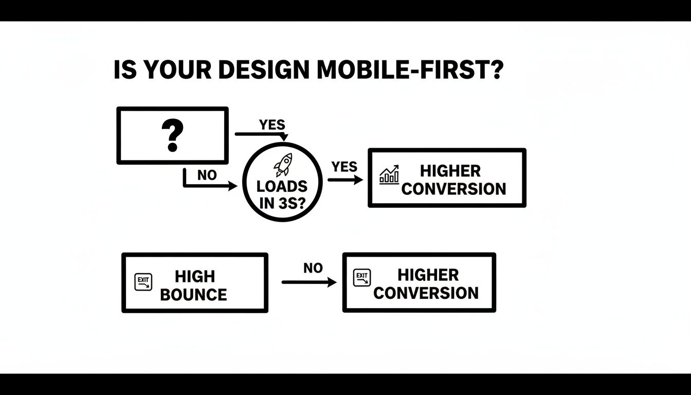
As you can see, a snappy mobile experience leads directly to better results, while a slow, clunky one is a surefire way to lose potential customers.
A mobile-first, responsive site starts with a strong plan, usually in the form of wireframes. You can learn more about how to create wireframes for websites in our detailed guide. And if you want to take the mobile experience even further, you can look into advanced techniques like making your site behave like an app on Android devices for an even more polished feel.
Your Essential Mobile-First Website Checklist

All the theory in the world doesn't mean much if your website falls flat in the real world. So, let's get practical. This isn't about code or complex analytics; it's about seeing your site through your customer's eyes.
Grab your phone—not your laptop—and pull up your website. Be honest with yourself as you go through these simple questions. This quick audit will show you exactly where your site shines and where it's letting you down from a mobile-first perspective.
First Impressions and Core Information
Think about someone finding your business while walking down a busy NYC street. They need info, and they need it now.
- The Three-Second Rule: Can you find your phone number or address in three seconds or less? If not, you’re making it too hard for people to contact you. This info needs to be front and center.
- Above the Fold: Without scrolling at all, can you see your main call-to-action (CTA)? Whether it's "Book Now," "Get a Quote," or "View Our Menu," it has to be immediately visible.
- Readability: Are you pinching and zooming just to read the text? If your visitors have to work to understand your message, they won't. They'll just leave.
Performance and Usability
Next, let's see how the site actually feels to use. A slow or awkward website is a surefire way to send a potential customer straight to a competitor.
Remember, your website isn’t just being viewed on fast office Wi-Fi. It needs to perform well on a spotty cellular connection in the middle of a busy street.
- Speed Test: How fast does your site load on a 4G or 5G connection, not Wi-Fi? A delay of just a few seconds can cause more than 50% of visitors to give up and go elsewhere.
- Form Friction: Try filling out a contact form yourself. Is it a breeze, or are tiny form fields and a clunky keyboard making it a nightmare? If it’s frustrating for you, it’s a deal-breaker for them.
- Thumb-Friendly Navigation: Can you comfortably tap every button and link with your thumb without accidentally hitting something next to it? Make sure your tap targets are big enough and have enough space around them.
Got Questions About Mobile-First Design? We've Got Answers.
Even after grasping the basics, it's natural for business owners to have questions about what a mobile-first approach actually looks like in practice. Let's walk through a few of the most common ones that come up.
Think of this as clearing up the final few hurdles. The goal is to show you that starting with the smallest screen is the smartest way to build a fantastic experience for all your customers, no matter how they find you.
Is This Going to Cost Me More?
Not usually, and it can actually save you money down the road. The mobile-first process forces you to be ruthless about what’s truly important on your site. This focus helps you avoid "feature creep"—that all-too-common habit of piling on expensive bells and whistles that don't add real value.
When you start with the essentials, you build a lean, powerful foundation. The alternative—designing a huge desktop site first and then trying to cram it onto a small screen—almost always leads to costly redesigns and headaches trying to fix a clunky mobile experience. Starting small is just more efficient.
How Can I Check if My Current Site is Genuinely Mobile-Friendly?
The quickest way is to just pull it up on your phone. But don't just glance at the homepage. Actually try to do something. Can you find your contact info and tap the phone number to call? Can you fill out a form without pinching, zooming, and getting annoyed?
Here’s a great little trick: try the "one-thumb test." Can you navigate the most critical parts of your site and achieve a primary goal—like booking an appointment or finding a location—using only your thumb? If you need two hands to wrangle the screen, it’s not truly built for mobile.
Won't a Mobile-First Site Look Empty or Boring on a Desktop?
Not at all. This is probably the biggest myth out there. Remember, the strategy is mobile-first, not mobile-only.
The design process builds on itself. Once the core mobile experience is locked in, designers use the extra space on tablets and desktops to enhance it. This could mean adding more detailed visuals, expanding navigation menus, or laying out content in more complex columns. The result is a desktop version that feels spacious and powerful, not cluttered and overwhelming. It's a clean, intentional experience on every single screen.
Ready to put your customers first with a website that works flawlessly everywhere? The team at Web Design at NY specializes in creating high-performance, mobile-first websites that drive leads and sales for NYC businesses. Get your free quote today!