A Modern Graphic Design Process for NYC Businesses

A solid graphic design process isn't just a checklist of tasks. Think of it as a reliable roadmap that takes you from a raw business idea all the way to a tangible, measurable result. It’s what turns subjective creative energy into a strategic business asset, making sure every design choice has a purpose beyond just looking good.
Why a Structured Design Process Matters More Than Ever
For any business trying to stand out in NYC, a proven process is the difference between a website that just sits there and one that actively pulls in leads. It’s your best defense against blown budgets, endless revision cycles, and a final design that completely misses the mark. A disciplined workflow brings clarity and, most importantly, a real return on your creative investment.
This modern, results-focused system didn't just pop up out of nowhere. It's the product of centuries of innovation. The roots of today's graphic design process go way back to inventions that turned one-off manual art into mass communication.
Think about Johann Gutenberg's printing press around 1450 or Alois Senefelder's invention of lithography in 1798. These weren't just new machines; they fundamentally changed the creative workflow, breaking it down into ideation, refinement, and production—a foundation we still build on today.
From Manual Art to Digital Precision
The jump from painstaking manual craftsmanship to the speed of digital design has been massive. Each leap forward brought new efficiencies and opened up new creative avenues, forcing agencies to adapt how they tackle projects.
This chart gives you a quick visual on how things have changed.
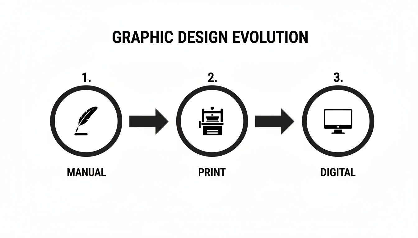
You can see a clear line from slow and manual to fast, accessible, and complex. This constant acceleration is exactly why we need a more strategic and structured approach than our predecessors ever did. The pace of change alone makes having an adaptable process non-negotiable.
A well-defined design process becomes a shared language between the client and the agency. It eliminates guesswork, sets clear expectations, and ensures the final product isn't just beautiful, but strategically sound and effective.
As new tools keep emerging, it’s crucial to understand how they fit into a professional workflow. For example, seeing the impact of AI in fashion content creation shows just how important it is for our design processes to be flexible and forward-thinking.
At the end of the day, a structured methodology is your greatest strategic advantage for turning a creative vision into commercial success.
Building the Foundation with Discovery and Strategy
Every truly effective design starts long before we ever open a design program. It begins with a deep dive into your business, your customers, and what you’re really trying to achieve. This is the discovery and strategy phase, and honestly, it’s the most important part of the entire process. It’s what separates a design that just looks good from one that actually gets results.
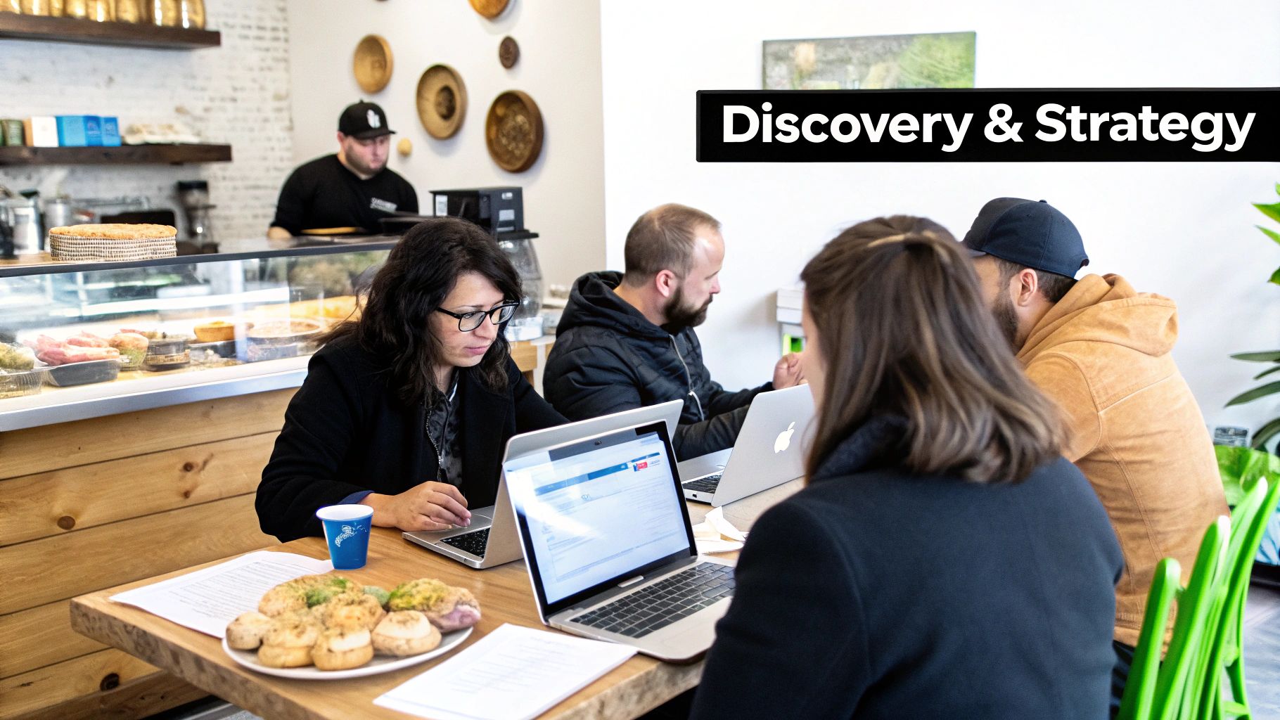
Think about a local NYC bakery. A pretty logo is nice, but great design captures that warm, inviting feeling a customer gets when they walk through the door. We can't solve a business problem if we don't understand it inside and out.
That's why every single project kicks off with an intensive discovery session. We’re not just checking boxes on a list of requirements; we’re laying the strategic groundwork that will guide every creative decision from here on out.
Digging Deep to Uncover Game-Changing Insights
Our discovery process isn’t about sending you a long questionnaire to fill out. It’s a hands-on, collaborative effort to get a complete picture of your world. Your business expertise plus our design and strategy experience is where the magic happens.
We usually focus on three key areas:
- Stakeholder Interviews: We sit down with the key players in your organization, from the CEO to the sales team. We want to hear about the business goals, the daily frustrations, and what success really looks like to them.
- Competitor Deep Dives: We become experts on your competition in the NYC market. We look at who’s doing it right, who’s missing the mark, and what visual cues are defining your industry. This helps us find your unique space.
- Audience Persona Workshops: Who are we talking to? Together, we’ll build a picture of your ideal customer, moving past simple demographics to understand their real motivations, challenges, and what they’re looking for from a brand like yours.
Time and again, this process reveals insights that even our clients hadn't fully realized. It’s an active, engaging conversation.
The Creative Brief: Our Project's North Star
All the incredible information we gather during discovery gets boiled down into one crucial document: the creative brief. Don't mistake this for a simple project summary. This is our strategic roadmap, the document that gets both our teams perfectly aligned on the objectives, audience, and messaging.
The creative brief is our shared compass. It ensures every font choice, color palette, and layout decision is measured against the strategic goals we set together. This keeps subjective feedback from derailing the project and wasting time.
A solid brief turns vague goals into clear, actionable direction. It defines not just what we're making, but why we're making it and for whom. It becomes the single source of truth for the rest of the design process. To see how this groundwork connects to your overall visual identity, take a look at our guide on how to create a brand identity.
A Real-World NYC Example
We recently worked with a service business in Manhattan that was convinced they needed a massive, expensive rebrand. They felt their look was dated and wasn't attracting the high-end corporate clients they wanted.
But during our discovery interviews, we found something fascinating. A huge chunk of their most profitable, loyal customers were actually smaller, family-run businesses who absolutely loved the company's approachable, no-frills vibe.
This one insight completely flipped the project on its head.
Instead of a full rebrand that would have pushed away their core audience, we proposed a brand refresh. We modernized the logo and updated the color scheme but were careful to keep the friendly, trustworthy feel their best customers valued. The result? They strengthened their connection with their base, saw a huge increase in referrals, and saved themselves from a rebrand that would have been a disaster. That's the power of doing the homework up front.
Bringing the Strategy to Life: First Visual Concepts
Okay, the strategy is locked in. We've done the research, we know the goals, and we understand the audience. Now for the fun part: turning all those words and ideas into something you can actually see. This is where the magic starts, but it’s a methodical kind of magic. It's less about a single "eureka!" moment and more about guided exploration to find your brand's unique visual voice.
This stage is all about collaboration. We'll be working closely to define the look and feel that will set the tone for everything that follows.
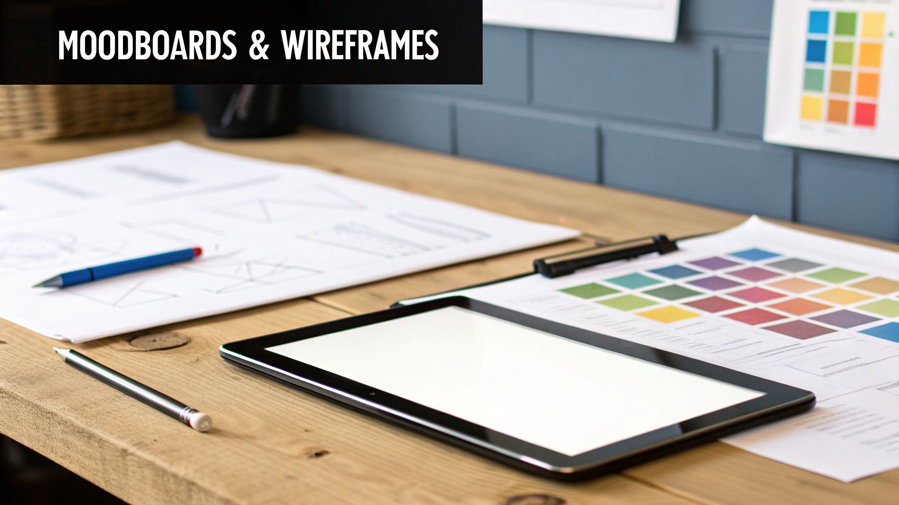
We kick things off by building a shared visual language, usually with mood boards or style scapes. Think of these as curated collections of images, colors, typography, and textures that capture a specific vibe. This simple step is crucial for making sure that when we say "modern" or "approachable," we're both picturing the same thing.
Finding the Vibe With Mood Boards
A mood board is essentially a visual brainstorm. It’s a low-risk, high-impact way to explore different creative directions before we dive into the deep end of design. By agreeing on a mood board, we establish the core aesthetic that will guide every other design decision down the line.
Here’s a real-world example. We worked with a Brooklyn e-commerce client selling handcrafted goods and presented two distinct mood boards:
- Concept A ("Urban Artisan"): This board was all about moody lighting, rich textures like reclaimed wood and concrete, and a sophisticated, darker color palette.
- Concept B ("Neighborhood Maker"): This one featured bright, natural light, candid photos of the artisans at work, and a warm, earthy color scheme.
The client instantly connected with "Neighborhood Maker." That one decision gave us a crystal-clear mandate for their website’s photography and color choices, saving us weeks of potential back-and-forth on mockups.
A mood board is more than just a pretty collage; it's a visual contract. It takes the abstract feelings from the creative brief and makes them tangible, ensuring everyone is on the same page and working toward the same visual goal.
This kind of rapid exploration is something we take for granted today. Back in the day, manual paste-up techniques meant a single layout could take 40-60 hours. The arrival of digital tools like Aldus PageMaker in the 1980s was a game-changer, slashing production time by up to 80%. You can read more about the evolution of design on rmcad.edu.
Building the Blueprint: Wireframes and Sketches
With the aesthetic vision taking shape, we switch gears to structure. This is where wireframes come in. A wireframe is a simple, black-and-white blueprint of a website or app. It deliberately strips away all the visual flair—no colors, no fonts, no images—to focus entirely on layout, hierarchy, and how a user will move through the site.
It's all about answering the big questions early:
- Where should the main call-to-action go for the best results?
- What’s the most logical path from the homepage to a product page?
- How should we organize the navigation so it's intuitive for users?
We recently used this approach for an NYC real estate agency. Their wireframes helped us map out the journey for someone searching for an apartment. It quickly became obvious that instant access to a map view and powerful filtering options were the top priorities. By solving this structural puzzle with simple boxes and lines first, we avoided expensive and time-consuming changes once the polished designs were underway.
This low-investment feedback loop is a massive time and money saver. It lets us nail down the core user experience before a single pixel of final design is created. For a deeper dive into this critical step, check out our guide on how to create wireframes for websites. This methodical process ensures the final design isn't just beautiful—it's built on a solid, user-focused foundation.
To help you understand what you'll see at each stage, here's a quick look at the typical deliverables throughout the design process.
Key Deliverables in the Graphic Design Process
This table breaks down the key items you'll review, their purpose, and what you should be looking for as a client.
| Phase | Key Deliverable | Purpose | What to Review |
|---|---|---|---|
| Discovery | Creative Brief | To document project goals, scope, audience, and constraints. | Does it accurately reflect your vision and business objectives? |
| Strategy | Mood Boards | To establish a shared visual language and aesthetic direction. | Does the mood align with your brand's personality? Which direction feels right? |
| Ideation | Wireframes/Sketches | To define the layout, structure, and user flow without visual distraction. | Is the content hierarchy logical? Is it easy to find key information? |
| Visual Design | High-Fidelity Mockups | To present a polished, full-color preview of the final design. | Do the colors, fonts, and imagery align with the mood board? Does it look professional? |
| Revisions | Revised Mockups | To incorporate client feedback and refine the visual design. | Have your requested changes been implemented correctly? |
| Handoff | Style Guide & Final Files | To provide all necessary assets and brand guidelines for implementation. | Are all file formats you need included? Is the style guide clear and comprehensive? |
Having a clear understanding of these deliverables helps set expectations and ensures a smoother, more collaborative process from start to finish.
Bringing the Vision to Life: Mockups & Revisions
With the blueprint signed off, it's time to put some paint on the walls. This is where your project sheds its grayscale wireframe skin and starts to look and feel like the real deal. We take that approved layout and inject your brand's unique personality—pulling in the logo, color palette, fonts, and imagery we locked down in the strategy phase.
This is the "big reveal" moment for most clients. It’s the first time you see what your new website or branding will actually look like. But a high-fidelity mockup is more than just a pretty picture; it's a detailed prototype showing how every strategic decision and visual element comes together.
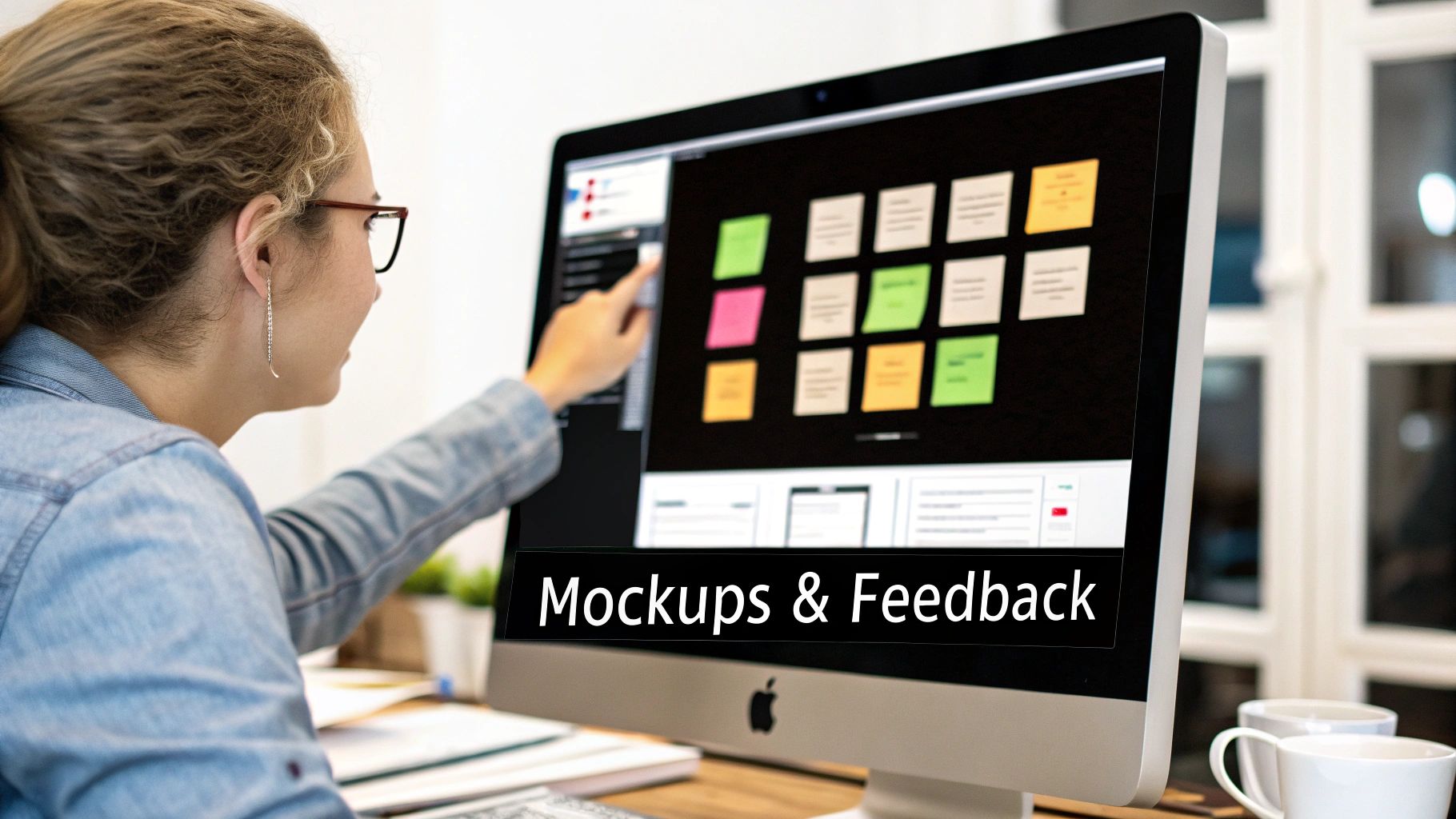
Our job is to create something that’s not just stunning but also intuitive. If you want to get a better handle on this critical stage, we've put together a comprehensive guide on how to create website mockups that digs into the nitty-gritty of making this part of the process a win.
Making Feedback Count
Once we deliver a polished mockup, we move into the most collaborative part of the entire process: feedback and revisions. Your insights here are what sharpen the design from good to perfect. But, and this is a big but, the way you give feedback can make or break the timeline.
To keep everything moving smoothly, we use tools that let you drop comments directly onto the design. Forget long, confusing email chains. You can point to a specific button, headline, or image and leave a note. It’s clear, it’s contextual, and it gives our designers exactly what they need to act on.
A successful revision phase is built on objective, goal-oriented feedback. The best comments are tied directly back to the project goals defined in our creative brief, moving the discussion from "I don't like this blue" to "Does this shade of blue convey the sense of trust our target audience values?"
This simple shift keeps everyone focused on the "why" behind the design, turning subjective opinions into a strategic, problem-solving conversation.
Tips for Providing Killer Design Feedback
Giving great feedback is a skill. To help us get to a final design faster, here’s how you can help:
- Gather Your Thoughts: Before you send anything, take a day to live with the design. Collect all your notes into one consolidated round of feedback. This avoids the chaotic back-and-forth that kills momentum.
- Be Specific and Explain Your "Why": Instead of just saying "make the logo bigger," try explaining the problem. "Can we increase the logo size a bit? I’m worried it gets lost next to that bold headline." Context helps us solve the root issue, not just the symptom.
- Tie it Back to the Brief: Always frame your feedback around the project's goals. For instance, "Does this call-to-action button pop enough to hit our lead generation target?" This ensures every tweak serves a real purpose.
This whole cycle is light-years faster than it used to be. Modern tools have slashed project timelines, with Adobe reporting 65% faster iterations since the days of analog design. In a competitive market like NYC, where 70% of small businesses say speed is vital for grabbing leads, this efficiency is everything. For a deeper dive, you can discover more about the evolution of graphic design software on indexx.com.
A Real-World Example: Taming the Feedback Beast
We recently built a new website for a Manhattan consulting firm. The first round of feedback on the homepage mockup was a mess—three different stakeholders sending contradictory notes in separate emails. The design was stuck, spinning its wheels on minor changes that weren't moving the needle.
We hit pause and scheduled a single 30-minute call.
By walking them through the mockup on a shared screen, we were able to get them to discuss their differing opinions and agree on a unified direction. Their final, consolidated request was a game-changer: reorder the page sections to better align with their sales pitch.
The revised user flow was instantly more compelling. After we launched the site, they reported a noticeable jump in qualified leads. All it took was streamlining the feedback process to get everyone on the same page, resulting in a design that actually worked. Our goal is always to make revisions a transparent and productive dialogue, so the final design is something we’re all excited to build.
Delivering and Launching for Long-Term Success
A brilliant design is only as good as its execution. After all the strategy sessions, collaborative reviews, and creative refinements, we finally get to the most exciting part: bringing your project to life. This final stage is all about making a smooth transition from a polished design file to a live, functioning asset that truly performs for your business.
The journey doesn't just stop once you approve a mockup. Instead, we move into a careful handoff and launch phase built to set your team up for success long after our initial project wraps. It's a common myth that a designer’s job is done when the visuals are locked in. Honestly, this is where we make sure all that hard work translates perfectly into the real world.
Our goal here is simple: to arm you and your developers with everything you need to implement the design flawlessly and keep your brand looking sharp.
The Handoff: A Toolkit for Your Team
The design handoff isn't just about emailing over a few JPEGs. Think of it as us delivering a comprehensive toolkit that becomes the single source of truth for your brand's entire visual identity. This organized package ensures anyone—from your web developer to your social media manager—can apply the new design with precision.
Here’s what you can expect to find in your final asset package:
- Organized Source Files: You’ll get the final, approved design files, typically in a program like Figma. These aren't just thrown together; they’re meticulously organized with clearly named layers and components, making it a breeze for developers to inspect styles and export what they need.
- A Complete Asset Library: All images, icons, and logos are exported in the exact formats (SVG, PNG, JPG) and sizes required for both web and print. This alone saves your team countless hours of guesswork and tedious resizing.
- A Detailed Brand Style Guide: This is the rulebook for your brand. It documents everything from official color codes (HEX, RGB, CMYK) and typography hierarchy to logo usage rules and component states (like how a button should look when you hover over it).
For a local NYC business, this level of detail means your new landing page will feel just as polished as a new print ad for the subway, creating a truly seamless customer experience.
Quality Assurance: A Pixel-Perfect Launch
Before your new website or app sees the light of day, we move into the Quality Assurance (QA) phase. This is a collaborative push where our design team works right alongside the development team to hunt down and fix any little inconsistencies between the approved mockup and the live build.
We comb through the site on different browsers and devices, checking for anything that looks off—spacing, colors, functionality. Is the mobile navigation working exactly as we planned? Does the typography look crisp on a high-resolution screen? This "pixel-perfect" review ensures the final product is a flawless representation of the vision we built together.
The QA process is the last line of defense against a sloppy launch. It protects your investment and ensures the user experience is exactly as we designed it, building trust and credibility with your audience from day one.
Beyond the Launch: Monitoring and Optimizing
Our partnership doesn’t have to end the moment your project goes live. A launch is really a beginning, not an end. The final piece of the puzzle is having a plan for post-launch monitoring and optimization.
Once real users start interacting with your new design, we can gather some incredibly valuable data. By digging into analytics and user feedback, we can spot clear opportunities to make things even better.
- Are users dropping off at a specific point in the checkout process?
- Is a key call-to-action button being ignored?
- What features are people actually using and loving the most?
This feedback loop turns your design from a static, one-time project into a living asset that evolves right alongside your business. By making small, data-driven tweaks over time, we ensure your design continues to deliver maximum value and a strong return on investment for years to come.
Your Top Questions About the Design Process, Answered
Jumping into a major design project is a big step. It’s a real investment of time and money, and you absolutely deserve to feel confident and in the loop from start to finish. We get asked a lot of the same questions by NYC business owners, so we’ve put together some straight, honest answers to the most common ones.
How Long Does a Typical Website Design Process Take?
This is always the first question, and the most honest answer is: it really depends on the scope. But for a standard small business website here in NYC, you can realistically expect the project to take anywhere from 6 to 12 weeks. That's from our initial kickoff call to the day your new site goes live.
That timeline isn’t just a random number; it’s broken down into a few key stages. A typical project schedule might look something like this:
- Discovery & Strategy: 1–2 weeks
- Wireframing & Concepts: 2–3 weeks
- High-Fidelity Design & Revisions: 2–4 weeks
- Development Handoff & QA: 1–3 weeks
Of course, things like building out custom e-commerce features, integrating specific software, or even just how quickly we get feedback can move that timeline. We’ll always map out a detailed project schedule right at the beginning, so you have a clear roadmap and know exactly what’s happening and when.
What Is Expected of Me During the Process?
Your role is absolutely crucial. We’re the design and tech experts, but you are the undisputed expert on your business, your customers, and your industry. The project’s success truly hinges on our collaboration.
Think of us as partners. Your main job is to provide timely, honest, and consolidated feedback at each key milestone. In the beginning, your insights will literally shape the entire strategy. Later on, when we're in the design phase, your constructive comments make sure the visuals we create are perfectly aligned with what your business needs to achieve.
Your active engagement is the secret ingredient. When you bring your deep business knowledge to the table and we match it with our design methodology, the final product is guaranteed to be something that drives real, measurable results for your company.
How Are Revisions Handled if I Don’t Like the First Design?
It's completely normal for a first draft not to hit the nail on the head—that’s exactly why revisions are a built-in part of any healthy creative process. Our entire approach is designed to get us on the same page early on with tools like mood boards and wireframes. This really cuts down on the chances of a big surprise when you see the more polished mockups.
Typically, our proposals include a set number of revision rounds (usually two or three) for the main design phase. If an initial concept misses the mark, we don't just go back to the drawing board blindly. We’ll hop on a call, pull up the creative brief and mood board, and figure out exactly where we got disconnected.
The key to a great revision is specific feedback. For example, hearing "This color palette feels too corporate and serious for our fun, youthful brand" is so much more helpful than just "I don't like it." That kind of detail lets our team make targeted, effective changes that get us to a final design you’ll absolutely love.
What Files Do I Get at the End of the Project?
Once you’ve given the final sign-off, we package everything up so you can actually use and maintain your new brand assets. You'll get a fully organized handoff with all the files you need, giving you total control and ensuring your brand looks consistent everywhere.
The exact files depend on the project, but here's a good idea of what a final delivery usually includes.
For a Branding/Logo Project:
- Vector Files (AI, EPS, SVG): These are the master files. You can scale them to the size of a billboard or a tiny website icon without losing any quality.
- Raster Files (PNG, JPG): These are ready-to-use versions for web, social media, and presentations, with transparent or solid backgrounds.
- A Detailed Style Guide (PDF): Think of this as your brand’s rulebook. It outlines the correct logo usage, color codes (HEX, RGB, CMYK), and typography to keep everything consistent.
For a Web Design Project:
- Organized Source Files: We’ll provide a link to the final designs in a program like Figma, with all the components and styles clearly laid out for your developer.
- A Complete UI Kit: This is a library of all the interactive elements—buttons, forms, navigation styles—which makes any future updates a breeze.
- Exported Assets: All the images, icons, and illustrations are provided in web-optimized formats, ready to be uploaded.
We make sure you have a comprehensive toolkit that empowers you to launch successfully and manage your brand with confidence for years to come.
At Web Design at NY, we believe a transparent, collaborative design process is the only way to build websites that don't just look great, but actually help NYC businesses grow. If you're ready to start a project built on clear communication and smart strategy, let's talk. Learn more about how we can help your business.